There’s x5 basic mistakes almost everyone is making on their websites and landing pages.
I see these over and over and over again across every sector, every niche.
These mistakes are Killing conversion and costing you sales.
So what I thought I would do is use a recent conversion audit for “Damn Good Security” as a case study, and go through specific steps you can apply to your own website to improve your sales conversion.
Let’s get straight to it.
If you want a recording of the full conversion audit, plus an audit of your own site you can subscribe to Life by Design below for instant access
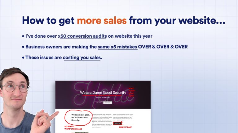
Watch a live conversion audit to get more sales from your website
Subscribe for instant access to a recorded conversion audit + I'll do a free audit of your own site.
Mistake 1 – Weak messaging in the hero section
Solution: put a clear, valuable offer in your hero section, and a button to the primary action you’d like them to take.
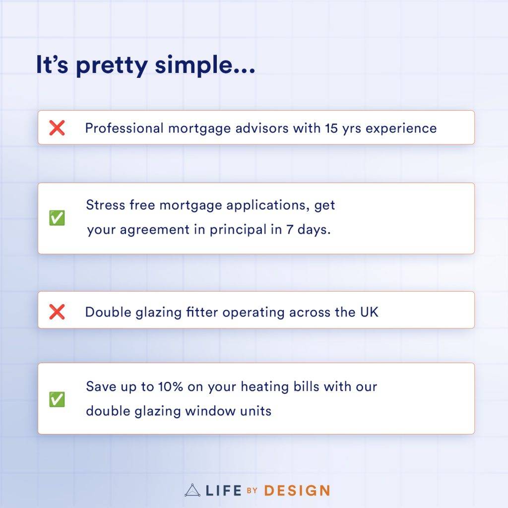
The hero section is often the biggest wasted opportunity I see on a website. The hero section is prime real estate, and most people waste it with weak copy.
The text in your hero seciton is the first thing a user sees; it takes up a full screen, but a lot of business owners waste this opportunity to convert prospects into clients, because their copy…
- Is too flowery
- Doesn’t communicate value
- Is generic or vague
People online are like goldfish. They have a 3 second attention span.
Which means you’ve got just 3 seconds to communicate what you do AND make a good first impression.
Most business owners waste this chance with vague statements like:
“We’re passionate about excellence”
“Professional web design services”
“We offer synergetic business solutions”
Yawn.
Or worse, they have a flowery, poetic line that sounds good but tells the user nothing. Creatives are particularly guilty of this.
“Our mission is to participate at the intersection of culture with authentic experiences”
What does that even mean? and how does any of this appeal to your leads?
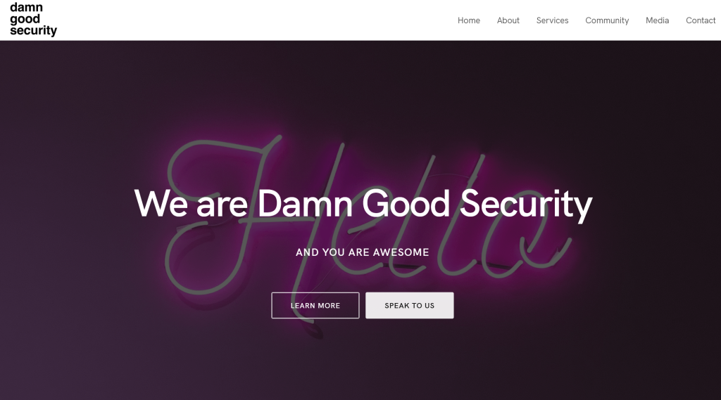
In my audit for Damn Good Security, we can see this issue here:
“We are damn good security, and you are awesome“
The prospect didn’t come here to feel awesome. They came here because:
A they’re shitting their pants because they have a security breach.
or B they want to feel reassured that they have the right partner to avoid being breached.
It’s got personality. It’s nice copy. There’s a place for nice copy. It builds your brand vibes..
But clever or flowery copy in the hero section is for you, not your prospects.
Your hero section is for converting traffic into leads.
So your hero section should immediately communicate value to your ideal client.
It should be crystal clear, not clever or creative. Obvious beats flowery every time.
Play the “So What” game with your website.
Every time you read a line of copy on your website, be your own “devil’s advocate” and ask yourself “So What?”
Be brutal. Keep asking that question, and replace the copy with the answer to that question, until you can’t go any deeper:
We are Damn Good Security!
So what?
We are the best in business at what we do!
So What?
We can solve threats quicker than our competitors, and we proactively research and prevent new threats!
So What?
We solve your problems before they become problems
So What?
“You don’t need to worry about costly cybersecurity breaches anymore.”
👆 Now we see the value the prospect wants.
You must first figure out how your services or products produce value for your clients.
You can then use this to create your offer statement.
Here’s a simple formula for your offer in your hero section:
Your hero section should tell the visitor
- Who you help
- What problem you solve
- How you solve it
- Why you should care
“We help [SPECIFIC TARGET AUDIENCE] to [SOLVE SPECIFIC PROBLEM] by [METHOD] so you can [DESIRED OUTCOME].”
It should call out who your ideal clients is, what their problem is and how you help them solve it.
For example:
“We help SMEs prevent cyber attacks before they happen. Protect your reputation and your bottom line.”

Get my free offer workshop
If you’re struggling with what to write in your hero section, I’ve created a free workshop on crafting offers that sell. It walks you through exactly how to identify your ideal client and create an offer statement that converts. You can grab my offer workshop here.
Subscribers get instant access to my step by step workshop to package your services into a profitable offer.
How to improve conversion on your hero section on your landing page
- Include a clear, value-led offer in the hero section of your website
- (optional) You may also include a graphic or photo that represents the product/service and the value you offer.
- Include a one-click way to book a call with you.
Mistake 2 – Being a faceless corporation
Solution: Be the face of the business
People buy from people, not faceless corporations.
This is why GoCompare has a ridiculous opera singer mascot, and evil banks use celebrities as their poster people.
Yet many small businesses and solopreneurs think looking “corporate” will make them seem bigger than they are.
Your wasting your biggest asset: Small businesses can offer lean, flexible, personalized services, in a way that large organisations, agencies and corporations simply can’t.
So even if you’re a one-person show, be the face of your business. If you’re self-conscious (or fugly) pick someone on your team who is comfortable being the face.
I plaster my face all over my own website, not because I enjoy looking at my own face, but because it builds trust with visitors.
You’ve spent years building authority in your industry.
You’ve been on podcasts, spoken at events, built a following.
Your face is your greatest asset – use it!
People buy from people they know, like, and trust. Your face is the fastest way to start building that relationship.
How to be approachable as a business
- A professional headshot in your hero section
- A short video VSL of you explaining your offer (1-5 minutes MAX)
- Photos of you working with clients
Mistake 3 – No proof, no trust
Solution: put a clear, valuable offer in your hero section, and a button to the primary action you’d like them to take.
In a world of fake news and AI content, trust is the new gold.
The 3rdcommon conversion mistake I see is business owners telling their prospects that they are the best at what they do, and expecting visitors to take their word for it.

So your Damn Good.
Ok; prove it.
People are far more likely to believe your Damn Good, if they receive the information from one of your customers, than they are to trust you at your word.
Here’s what your website needs to build instant trust:
- Client testimonials (the more, the better)
- Video testimonials (these are gold)
- Logos of companies you’ve worked with
- Media mentions or features
- Industry accreditations
- Awards or recognition
Anyone that you’ve worked with can be a testimonial, even if they were with a previous employer or business.
Your testimonials should be the 2nd or 3rd item on your landing page
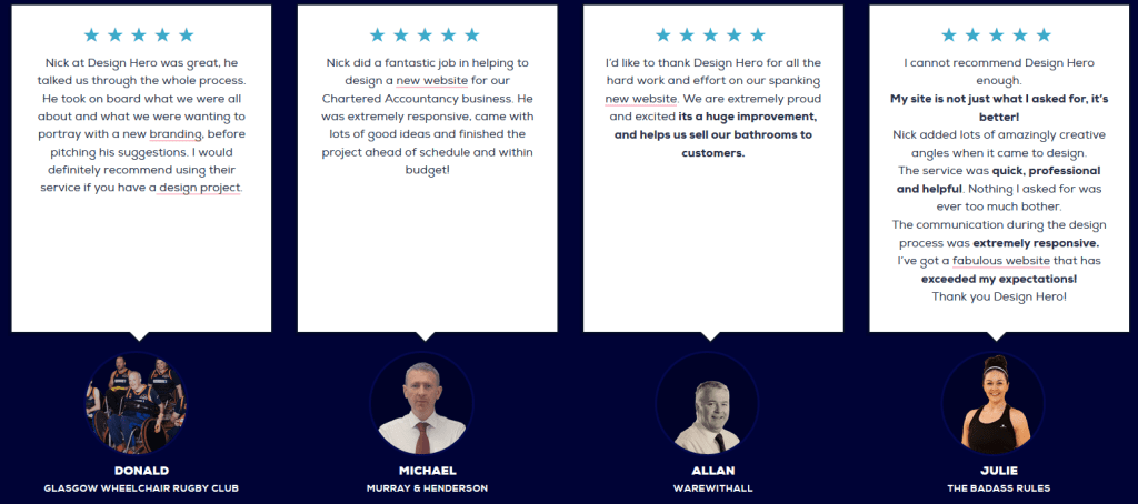
When it comes to reviews, there’s no such thing as too many.
When displaying testimonials, bold the value you delivered, not the services you provided. People care about outcomes.

Of course, getting reviews isn’t easy…
I currently have over 85 five-star Google reviews for my design agency. That’s not luck or magic – it’s a system.
I’ve developed a simple process for getting glowing testimonials from almost every client. It’s not about pestering them – it’s about asking the right questions at the right time in the right format. You can steal my system for gathering good reviews
Aside from testimonials, there are other things you can do to build trust.
“accolade” style snippets taken from longer reviews also work well.
Accreditation’s or logos from industry registration bodies, any awards you’ve won, or even press mentions are worth adding to your homepage to build social proof and trust.
People only buy from people they trust. So a minimum level of social trust is essential for site visitors to book a call with you.
How to improve trust on your website
- include testimonials,
- video reviews
- accreditation logos
- mention press, features, awards.
- Accolades
Mistake 4 – Making it difficult to buy from you
Solution: include a sticky contact button that allows them to book a call without friction
Rule number four is “make it easy to buy from you”.
A lot of solopreneurs make it difficult for clients to book a call, or they make them go through unnecessary steps.
If you want to get your prospects onto a Zoom call, why are you making them fill out a contact form first?
Whilst most websites are using email contact forms, this is often the least effective way to close a sale.
You’re essentially having a text conversation with someone with no context or emotional or, or body language.
By the time you get back to the prospect they’ve either been distracted by another project, or closed the deal with someone else.
Emails are the WEAKEST way to sell. It’s like trying to have a meaningful conversation by sending letters back and forth over several days. Channels for a sales conversation in order of effectiveness:
- In person
- remote video calls
- phone calls
- messaging / chat
I don’t have time to do all my sales calls in person so I do Zoom calls, or by phone.
I use Calendly for this, with a mini sales pitch in the sidebar to reinforce why they should book the call. It links directly to my CRM so I can track conversions.
I’d recommend replacing email forms with booking a video call with you (you can still ask the questions from your contact form on your booking page).

Make sure they can book a zoom call or a phone call with one click, and make sure that button is obvious and visible at all times.
If you want the system I use for appointment booking, plus followup sequences here’s my step-by-step guide to setting up an automated booking system.
How to make it easy to buy from you
- Sticky contact buttons
- Automated one-click call booking system
- Clear contact information (phone, email) for those who prefer traditional methods
- If your goal is to get them on a call, don’t put a cookie-cutter email contact form on there, put an embedded calendar.
Mistake 5 – Being confusing
Solution: Include FAQs, How it Works, Preaddress common objections
Lack of clarity kills sales.
Every time the prospect has a question mark in their head, it reduces the chances of them contacting you or closing.
Remember: people fear what they don’t understand. Yet many websites I audit are vague about critical information:
So make it obvious:
- What exactly do you do?
- How does your process work?
- How much does it cost (see this article on whether to show or hide prices on your website)
- What happens after I contact you?
You should also Include:
- Clear service thumbnails with brief descriptions
- A step-by-step breakdown of your process
- What the first step is
- How billing structure works.
Every question you get asked in your sales calls, should be added to a set of FAQs on your sales page.
Pre-address any objections or concerns before they arise:
- “How do you charge?”
- “What if I need support outside business hours?”
- “How quickly can you start?”
- “What happens if I’m not happy with the results?”
How to reduce sales friction on your landing pages
- Preaddress any sales objections or questions BEFORE they get on the call
- Show clear service thumbnails
- Give a step by step breakdown of your Process, graphics work well for this.
- Tell them how the service and billing works
- Include FAQs for any questions you get asked on sales calls.
Summary
That’s it for me.
So Just to summarise, the top five ways to get more sales out of your website is:
- Stop wasting the opportunity in the hero section. Call out who, why, and how you’re helping your clients.
Take my offer workshop if you want to help figuring out who your ideal client is and how you help them. - Build trust. Social trust is essential. You want to have accreditation logos, testimonials, media features. All this stuff should be on your home page
- Make it easy for people to buy from you. Sticky contact buttons. One click to book a call.
- Number four, don’t be a faceless business. People buy from people. So get your face on there.
- Make it obvious. Pre-address any sales objections or questions before they get in the call. Putting FAQs with any questions that people may ask so it’s clear.
Want to book me to do a conversion audit of your website or landing page?
I charge £50 for my landing page audits. Which means if you sell your services for just £1000, and this helps you get just x1 more sale, that’s a 2000% return on investment. Here’s a link where you can book a sales conversion audit
Or you can subscribe to Life by Design and get x1 audit for free, plus you’ll get instant access to the full video audit where I go into more detail
Watch a live conversion audit to get more sales from your website
Subscribe for instant access to a recorded conversion audit + I'll do a free audit of your own site.